The purpose of design has always been two-fold. While stylistic definition is at the forefront of any object, purpose, function and integration into daily life are just as pivotal. Using this mantra to supreme effect is designer Tom Dixon in his collaboration with Johnnie Walker.
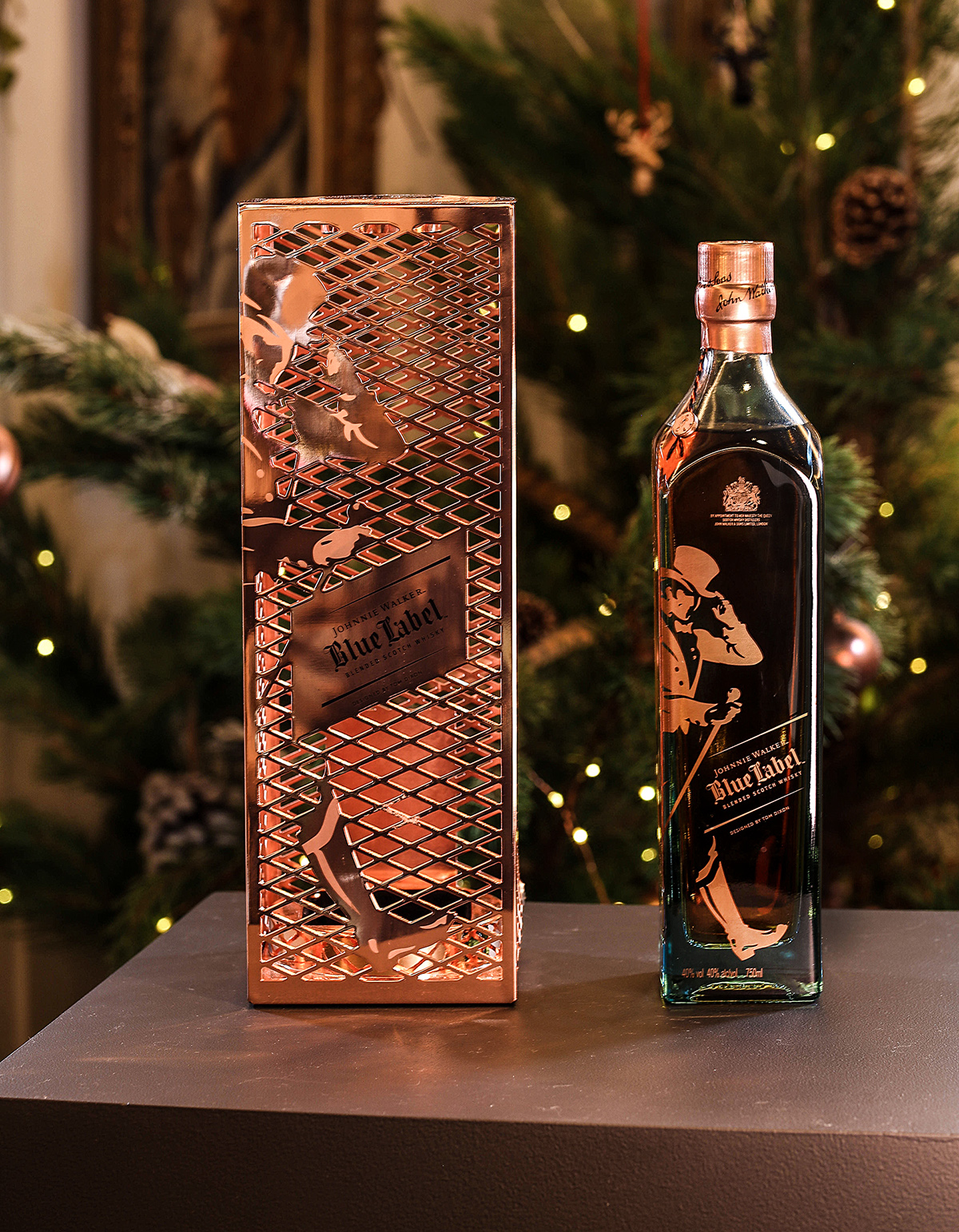
Inspired by the art of whisky making and the craftsmanship that goes into each bottle of Blue Label, the project is synonymous of Dixon’s most notable objects to date. The collaboration features a series of objects including an ice bucket, coaster and bottle cap. Most highlighted however is the casing. With copper accents spiralling across the centrepiece it satisfies both the introvert and extrovert with its delicate stem detailing.

Enclosed within this oblong though lies a customised bottle of Johnnie Walker Blue label. As distinguishable as the case, Johnnie Walker Blue label represents a blend of finely crafted whisky’s. Approachable, rich, yet silky on the tongue it represents the houses most distinguishable barrels.
The combination of traditional whiskey house and exuberant design firm demonstrates the forward-thinking nature of the collaboration that was unveiled at Milan Design week. While Whisky at times fails to deliver a clear point of difference, Johnnie Walkers approach helps them add credibility where others may lack.

On the surface the partnership juxtaposes two distant crafts yet the similarities between Tom Dixon and master blender Jim Beveridge are plentiful. Demonstrating the need Their approach to raw materials, patience and dedication in curation of the product bond the two trades.